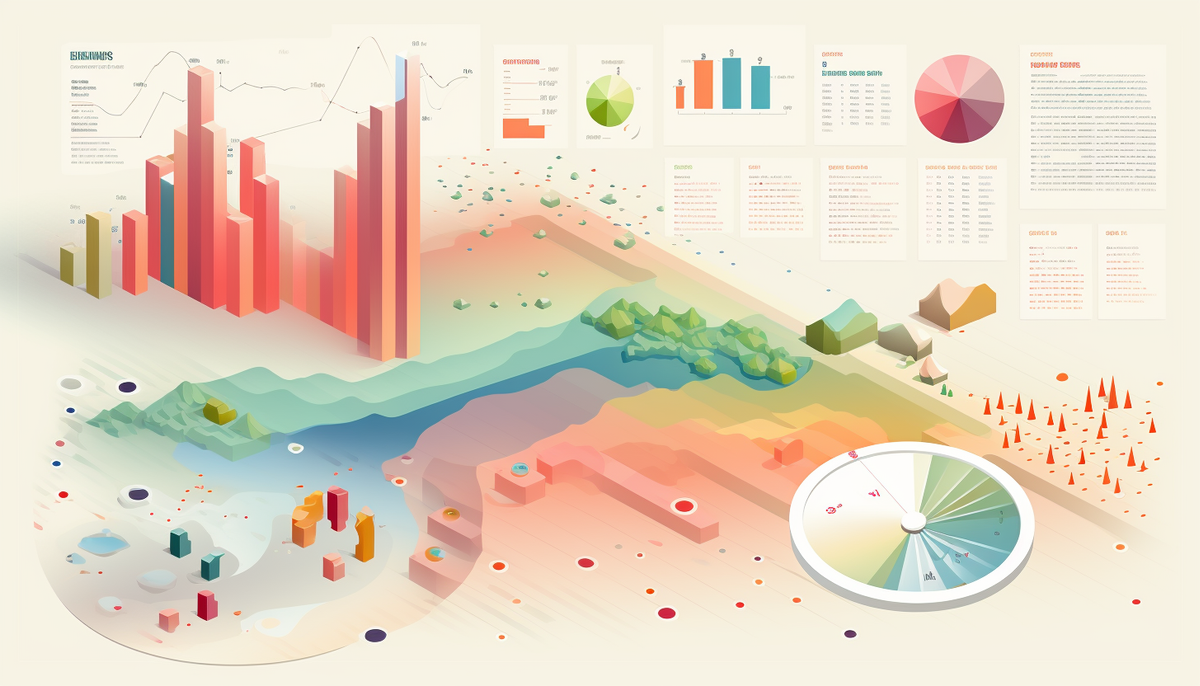
10 tips for data visualization
We live in a world full of information. And it could overkill the attention, so you won’t be able to learn something new. But the necessity to understand the constant flow of information isn’t going anywhere.
If you want to share information in a friendly manner, visualize it correctly. That’s why we are gathering 10 proven tips for you. They will help you structurize the data for whatever purpose you may need. Bookmark this article to have quick access to powerful tips that benefit your work!
Why is data visualization important?
The average human attention span varies from 7 to 9 seconds. Thus it’s crucial to visualize the data straightforwardly. And tables are not always a perfect solution. Sometimes they can be better than charts, but they often are too cluttered. So many people tend to skip them even when they provide important information.
That’s why we recommend you visualize it in the picture so readers can save it on their devices. As it says, a picture is worth a thousand words, and it’s your case if you want to provide data in the most friendly way. Implement the next tips in your workflow to ensure that everyone will understand your charts the way you created them!
Tell the story: realize what you have wanted to say

Everything in our world is storytelling. Especially when explaining something to other people, like when you build a table or make a visualization. There is some story behind it and consequences you want to show people who will see it. Before making a chart ask yourself:
- What are you showing?
- Who will see your visualization?
- Why are you doing it? What are your goals?
- What are possible questions from a target audience?
- Will your visualization be clear to the target audience?
- What did you want to say?
- What are you doing with that visualization? Is it a comparison, proportion revealing, distribution, etc?
Remember that the end justifies the means. If some decision is tough for you but clearly shows data to the audience, spend some extra time creating a visualization. This time will pay off. And the first thing that you need to do is to figure out your true intentions.
Pick the main KPI and focus on it
We understand that you want to show everything. But less is better. When you provide too much data, it creates visual clutter. Your viewers will stop to understand what you are trying to say. And the whole point of visualization gets ruined.
So, think wisely while picking the main goal and KPI. Try traffic light color coding where red signalizes bad results and green is about satisfactory results. Try the gauge indicator. You don’t have to implement exactly those tricks, they are just ideas that can help you.
The main thing that your chart should focus on is one goal and one main KPI. Does your team lead ask you to focus on another goal? Rethink your visualization and maybe change the chart type.
To make it as clear as possible, imagine that you show it to your grandma. That way you can find your goals, remove unnecessary details, and pick the most suitable visualization type.
Imagine that you say “Here we want to see if our Instagram campaign with famous bloggers helps us sell our new product”. So you filter out pie and bar charts. Despite the two most common visualizations, they won’t help you see the time and view-related correlations.
Use mind maps in the creation process to find hidden relationships between points
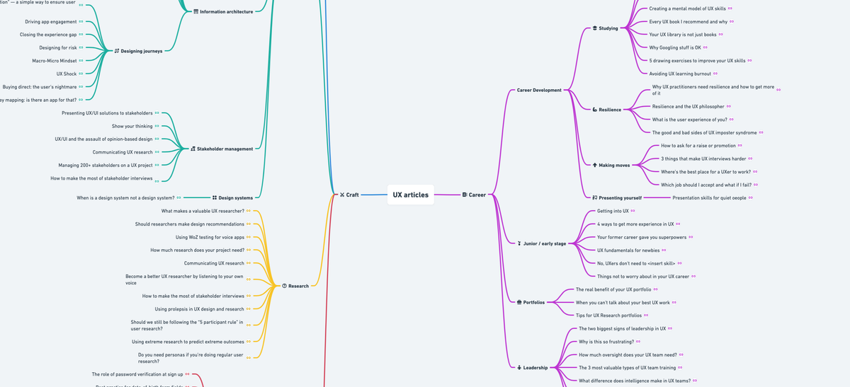
If you need to explore the cause-effect relationships, build a mind map to understand the bond between different parts of the situation you are trying to visualize. Moreover, you can use this mind map in presentations and official documents.
But if you need to use this picture on the website or other media where users mostly see it from mobiles, try simpler solutions.
Pick the suitable chart type
As we said, it should be as clear as possible. It will be perfect if you create a comprehensible chart that doesn’t even need a legend. But in some cases, you can’t be without it. That’s why we need to make a friendly visualization that shows everything but doesn’t overwhelm us.
Use Miller’s law or “The magical number seven, plus or minus two” that tells us that humans can keep in mind 7±2 objects simultaneously. And text is already an object.
Jonathan Schwabish already described almost any possible chart and situations where you can use it in his book “Better data visualizations”. We gather the most common usage cases to save you time. If you are interested in this topic even more, we recommend you to read his book.
To compare stable categories try bar charts. It can be a classic bar chart, paired, stacked, or diverging chart. You can also try Marimekko and mosaic charts: it’s an uncommon variation of bar charts that can cover multiple variables. For example, bar length can cover the main point of the visualization, and width can cover additional factors such as popularity, range of use, etc.
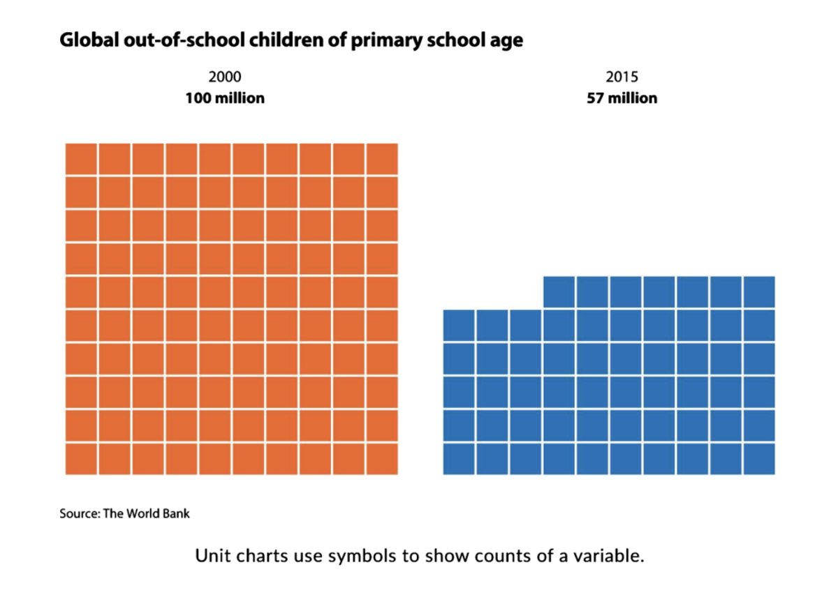
Other popular charts are unit and waffle visualizations. They allow you to compare different parts and even approximately calculate the dynamic between them. Imagine that you have an electronic shop and sold 180 smartwatches in July, but in August there were only 100 watches sold. So each cube on this chart can represent 10 sold watches. And the July waffle has 18 blocks, while the August one has only 10.
If you need to track something that changes over time, look closely at the line charts, including sparklines, bump, and slope charts. You can add 5-10 variables to the chart, and it still will look OK. Try different labeling to find what suits you better.
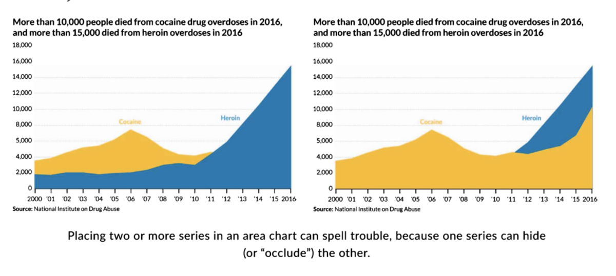
Even the area chart could be considered a line chart because you can place the variable on axis Y and time on axis X. Bun, in this case, you can add up to 3 variables. Otherwise, people won’t understand what you try to show them.
If you look for a chart that shows the distribution or compares different statistical numbers, try histogram and pyramid charts. If you don’t have perfectly accurate data, use a confidence interval (where top and bottom lines show approximate numbers) or a gradient chart where borders are literally vague.
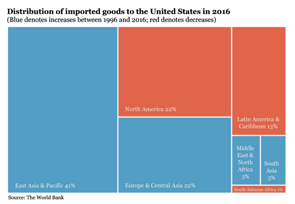
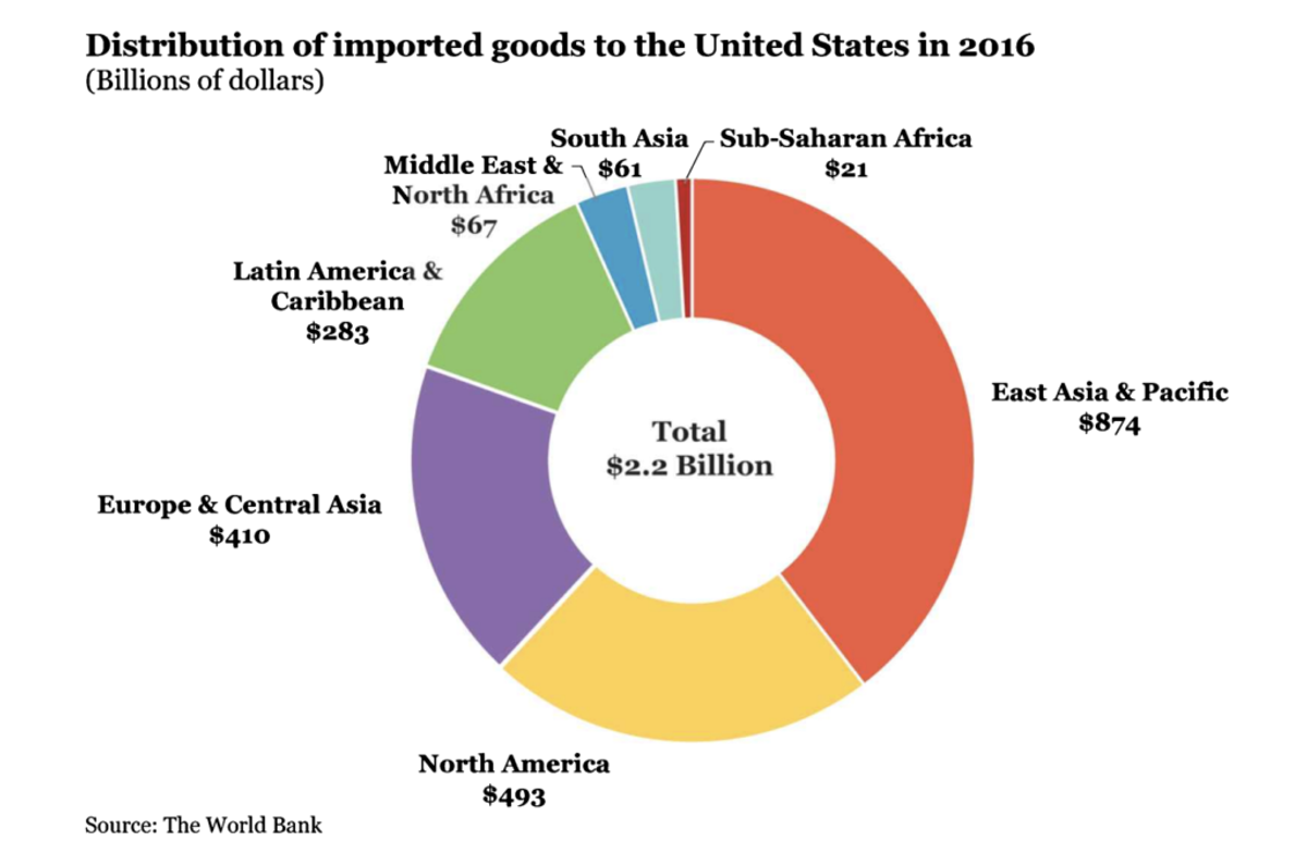
For those who have geo-related data, we recommend taking a closer look at the geospatial charts. Here your viewer can see themself. Like literally. When people see geo charts they usually get interested and start to explore it trying to find their homes. But it may be hard to cluster if you have scattered geo data. In this situation, you can try a choropleth map та cartogram.
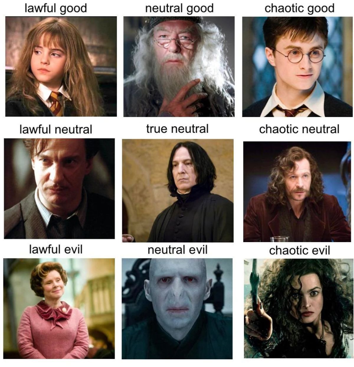
But what to do when you need to show relationships between variables? Many people use scatterplots with multiple axes bounded by a few characteristics. The most famous example is “Good, Bad, and Neutral” memes providing a morality grid of persons in some imaginary universe.
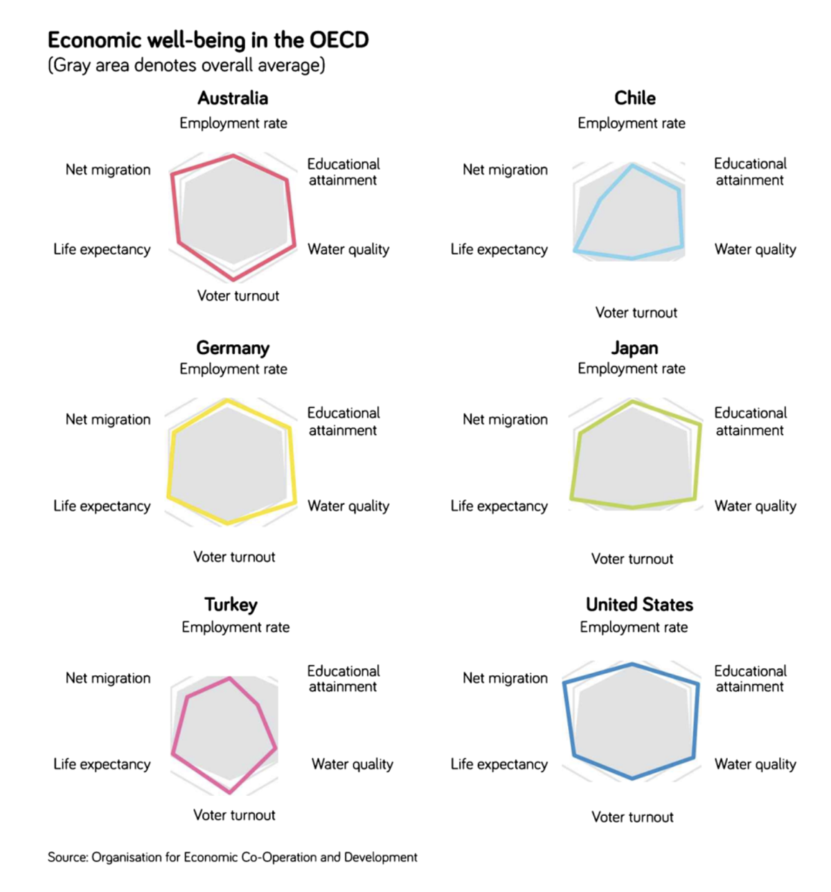
Another example of how you can visualize relationships between variables is radar charts. They also suit you when you need to show the strengths and weaknesses of the objects.
To show how different amounts of something are related to the total result, use part-to-whole graphs. The most common is the pie chart. Some like them, while some describe it as the worst chart. We think that it’s a good chart that does its job perfectly. But you need to understand its key characteristics. We will talk about it in a few sections below.
You can also use a treemap for showing part-to-whole relations. It’s not about the actual trees. It’s a big square split into multiple squares in different proportions. So it can be considered as a square version of the pie chart.
Add some white space
Don’t be afraid of emptiness. It’s your friend. As we said, you should not have more than 9 objects in the field of view. But even when you have 3 or 5 items, they should not be squashed like cars in the morning jam.
Provide some space. Give the info a place to breathe. Don’t squish it. Remember that less is better: provide only needed info. Leave additional decoration to other parts of the presentation/document.
Don’t be afraid of heat maps
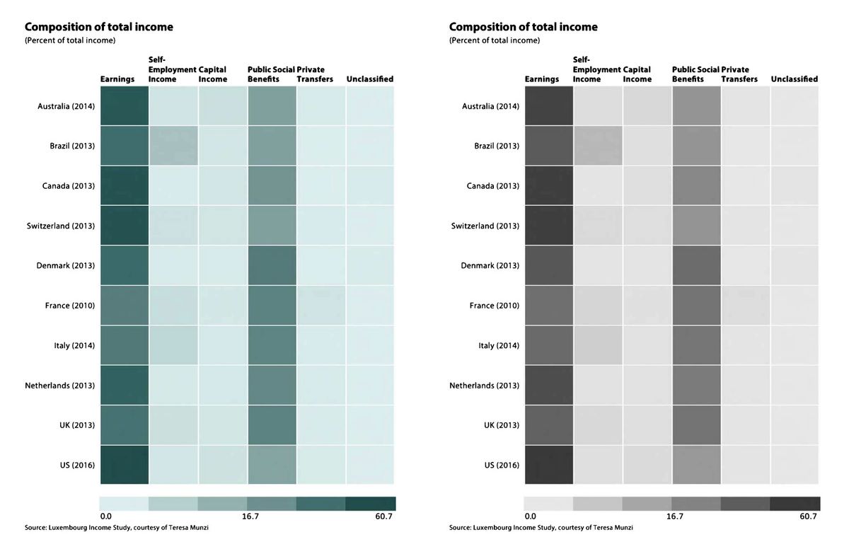
Color can tell a lot. Sometimes even more than a word. Even when it’s a shade of gray. Big tables are hard to comprehend even when you spend weeks building them. But understanding a true dynamic in those tables is even harder.
But once you change numbers to the color gradation and out a legend that describes each color, it becomes clear. But make sure that it’s a gradation that will be accessible even to colorblind people.
The easiest way to figure it out is to screenshot the heatmap and convert this image into black-and-white mode. If the shades of gray still are intuitively understandable, you did a great job.
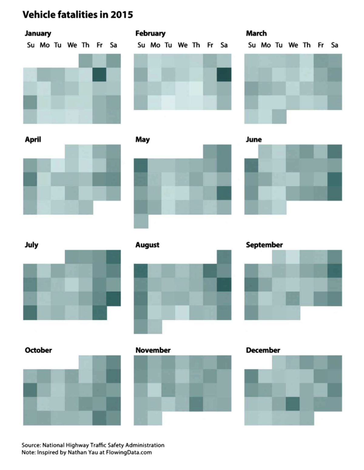
Heatmaps are a great way to show a lot of information, and it’s dynamic in the short or long run. The human brain comprehends the gradient string of a heatmap as one object, so you can easily add multiple strings without overwhelming viewers.
Cluster the data
If you have a lot of information to show, cluster it. According to Gestalt Principles for Data Visualization, closely related data should be placed in one place, so others can understand your intentions more clearly.
Putting a real-life analogy, we can compare it with road signs. Warning road signs in Europe are equilateral triangles with a red frame. In the USA they all are warm yellow diamonds. Developers do it to cluster the information, so even when you don’t see what’s in the sign, you already know that you need to put special attention on the road.
Cluster the data, so your viewers will know what to expect from your visualization.
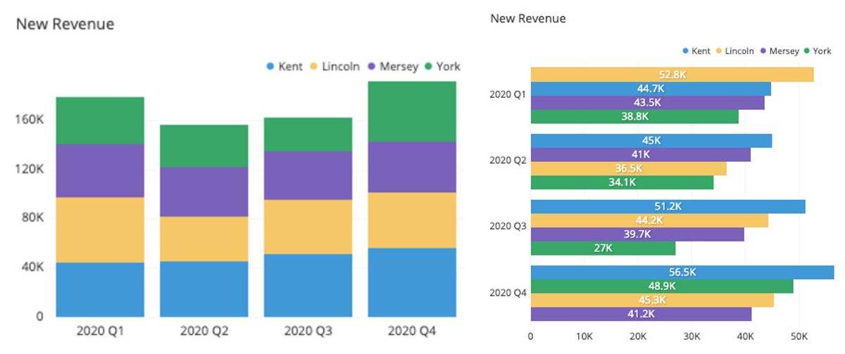
In the first chart, you can compare the revenue of different salesmen. You don’t get a total revenue and the approximate percentage ratio of every salesperson to the total revenue. But you see it in the second picture. The same info yet different clusterization can serve completely other purposes.
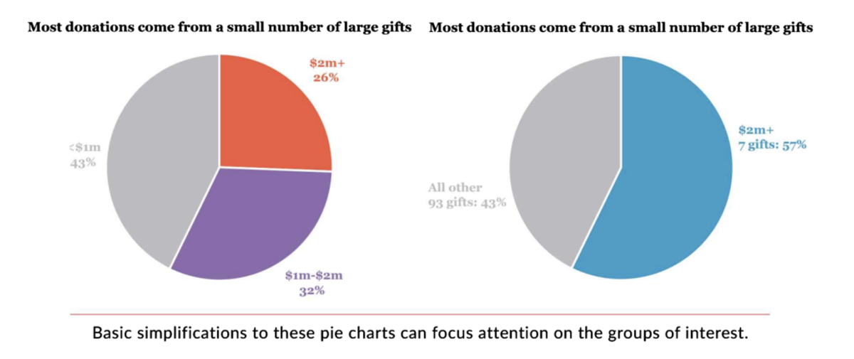
Don’t be afraid of pie and donut charts
For some reason, many people fear those charts and avoid them. Many people even promote the idea that you should forget those charts. But we strongly disagree with them.
Round shape figures are naturally easy to understand. Those charts show a part-to-whole relation, where each result is placed in a section. It may be hard to understand the difference between highly similar sections.
That’s why if it’s vital to witness the tiniest differences between sections, pick another chart. But if you need to see just an approximate amount (like 10%, 18%, 27%, and 45%) or it’s not critical to spot the difference between 10% and 11%, choose this option.
Make sure that it will be 100% in sum. Neither 99% nor 101%. It should be 100%. Also, don’t put too many slices. Remember about the magic number 7. Your text already takes place with 1-3 elements, depending on how you place it.
You can place the text and numbers in the visualization without making a legend. So play it safe and put only 3-5 slices in the chart.
Use intuitively clear visual cues
The best visualization is one that will be understandable without any text. Think about what visual cues you can add to make your chart clearer. Maybe it’s a similar shape, color, or size. Maybe it’s a gradient that can show the dynamic and cause-effect relationship. Once you decide to choose color-related cues, test them in a black-and-white environment. Make sure that it will be understandable to colorblind people.
Add text only when it is needed
We previously said it a couple of times, but it’s such a common mistake that it needs its own section. Text is just a complementary feature to the chart, but not the main part of it. If you can build a chart without any text, do it. If you need some text, don’t spam. Put only a few words to describe it. It will be enough.
If you need a lot of words to describe a chart, you’ve picked the wrong type. Change the visualization.
Wrapping up: less is best
People should understand what you are trying to say at first sight. Sometimes businesses provide more misleading visualizations rather than close-to-truth options. Remember next:
- Don’t start the chart from a random place. Starting point may not be a zero, but it should be similar to all variables. Take your time and figure out the correct axis start.
- Don’t change the aspect ratio. It should stay consistent. Otherwise, viewers don’t get what you are trying to show.
- Less is better. Don’t overwhelm the reader. Leave only the most crucial data.
- Add white space. We understand that you want to use every pixel, but let information breathe. So choose minimalism to make your visualizations understandable.
- Screenshot the chart and convert this image to black-and-white to ensure that the color choice in your visualizations is understandable even to colorblind people.
If you are unsure what visualization fits your case the most, test it on colleagues from different divisions. Usually, they don’t know that much about your project, so they can look at your charts with fresh eyes. It helps you pick the most friendly illustration.